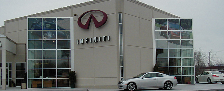
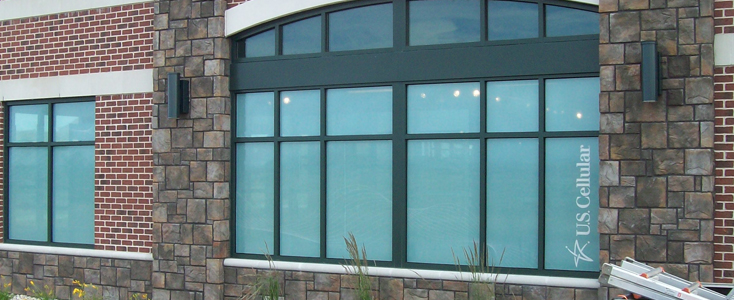
If you’re a fan of this blog, you’ll know that we occasionally talk about using window graphics to promote your business or organization. There are other posts that go in-depth about the features and benefits of a graphic, but that begs the question, what do you put on the graphics? Well, think of them like a sign—they’re primarily meant to get you easy recognition from traffic streams around your building. That could be pedestrian traffic if you’re in a mall setting, or they could get attention from adjacent roads or lot traffic. It should be an anchor point to help draw people in, whether or not they’re looking for you. Here’s a few points to think about when you’re planning for your window graphic.
Content

What do you want your window graphics to communicate? Here’re a couple of quick ideas:
- Store Features: Are there any new features in the store? Even advertising a new operating schedule is a good cause for a graphic.
- New Proposition: Do you want to advertise a new product or service? These can draw in new customers and give past customers a reason to reacquaint themselves with you.
- Price Change: Are you offering new prices? Reduced prices or new packaging is always interesting to potential customers.
Regardless of what you actually want to talk about, remember that you’ll want to try to get that message across in as little time as possible. You’ll get, at most, 3 seconds to make an impression on passers-by. Try this exercise: pick a single message, and write it down. Then, rewrite it to try to make it shorter. Keep rewriting until you can convey your idea in five words or fewer.
Convey an Image

There’s a big list of things that you can think about to help you convey an image. But if you want to boil it down to the base elements, you’ll need to think about these three categories:
- Fonts: Are they playful? Serious? Stern? Professional? How does that relate to your business’ tone?
- Image: Are you using an image that will reflect well on your brand? What about the message?
- Color Scheme: Is your color scheme going to be visible? Does it contrast well? We’ve got designers on staff that can help you make sure everything will show up well.
What Makes an Effective Graphic?

Once you’ve got your message and your visuals planned out, how do you get the most out of your graphic? First, think about quality production. Choose a type of graphic that will work well for your type of business, and think of it as an investment. The average window graphic will last you for a full year before you’ll have to even think about replacing it. Also, consider where you’re going to put it. If you’ve got a window that’s behind a huge parking meter or a major truck delivery spot, that window might now be the best choice. Finally, try for one message at a time. Too many graphics or accompanying signs can confuse and disorient customer—so put your best foot forward, and not every foot.
Any Great Graphics?

Have you seen any great graphics that abide by these rules that you want to compliment? How about any deviations that seem to do really well?