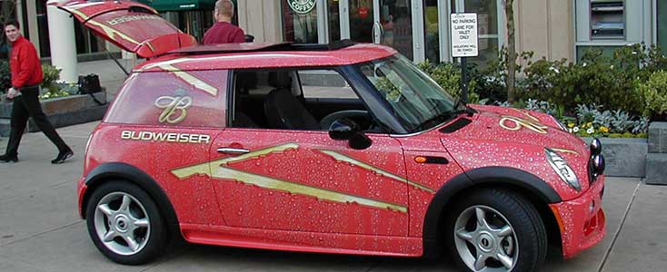
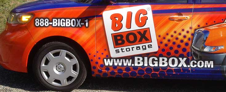
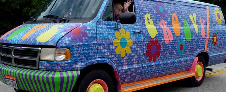
If you’ve got a business that’s has a mobile, real-world presence, then you’ll know that a vehicle wrap is a popular way to get leverage out of your field presence. But some wraps, though well-intentioned, are difficult to interpret. After all, the best way to determine if the money spent on your wrap was a good investment is to get a good response—and a good response comes from good messaging.
Make sure that the message you’re sending comes across by following these four rules for Vehicle Wrap Design.
1. Build on a Great Brand

If you don’t have a great brand identity (or even just a good logo) reflected in your wrap, then you’ll compromise its effectiveness. There’s a caveat to this rule: if you’re building on a national-level brand, then you can say more with far less iconography, which means you can get away with less emphasis on the brand. But for smaller organizations, a brand is about communicating what you offer and what values set you apart from others in that market space.
2. Think Past Photos

This point is up for debate, but the question boils down to this: do photos connect with the audience to communicate the brand well? Granted, some photos could explain the business very well—and especially if the pictures are relevant action shots. But be careful to use these photos to demonstrate only if you’re in a direct-to-consumer business. A picture sizzling steak is great for a restaurant, but may be misleading for a grocery distributor. But a picture of a car doesn’t tell the viewer if the business is rentals, sales, detailing, painting, or mechanical work.
This problem gets amplified when you consider how very little time the viewers have to take in the message. Can a commuter look at a picture on your car or truck and figure out what kind of business you’re in before they need to look away? The key to choosing a photo is choosing one that easily and accurately describes your offer well enough that you don’t need anything else to communicate it. But even if you are thinking about a photo, leave your options open for other design concepts.
3. Limit Copy

Copy is a marketing term that basically just means persuasive or informative writing or words. Most of the services on this site have copy in them, and your website probably does too. But what kind of copy does your vehicle wrap need? Any good wrap needs to have two component parts: A strong brand message and a web address—and maybe a phone number.
So, you might be thinking, it doesn’t need copy at all, right? Well, maybe. You might add in a tagline—but you really don’t want to go with a bullet list or paragraph. Remember, this is about very quick impressions. But regardless of whether you’re using a tagline or if you’re just getting across the message in your brand, you need to remember to keep the writing big and legible for people passing by.
4. The Zen of Getting Attention

The best way to get attention is with simple, effective, straight forward design. Design that attracts the attention of people who are looking for it is great—flashy, off message elements that shout at people is inappropriate. Diamond plating or tribal flames or anything of that sort are right out.
Just remember that this is a quick impression medium, and there isn’t time to explain every feature that you’re offering. Choose a single message and present it with crystal clarity to the people who want to hear it.